The Lufkin Community Partners needed help to better communicate that they were an organization that was larger than one “project”. We approached the organization and were able to donate our branding strategy and logo design. Our logo incorporates numerous colors and hands to signify a more child-like attitude, diversity, and community. We utilized a box and strong lettering to portray a business-like feel and a solid foundation. The hands are able to reach outside the “box” as this signifies “outside the box” thinking.
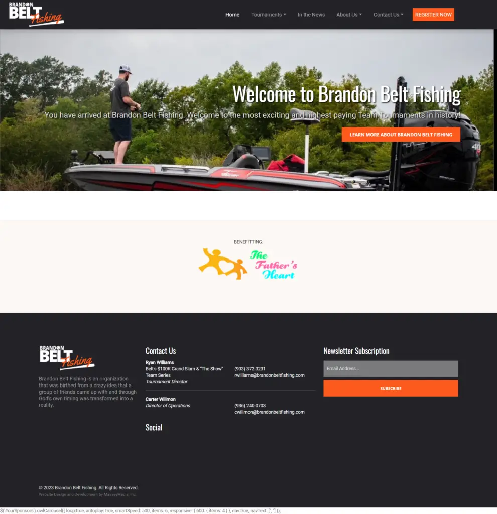
Brandon Belt Fishing – Website Design
The Brandon Belt Fishing group approached MasseyMedia with the need for a new eCommerce website for their new venture. An eCommerce website was developed allowing anglers to register for upcoming tournaments. The Website Design was built to ensure easy access to tournament information and registration.

